


southern trust mortgage
Logo design for mortgage company brand refresh

Custom vehicle wrap for Norfolk, VA franchise

Logo created for WHRO Public Media's educational series
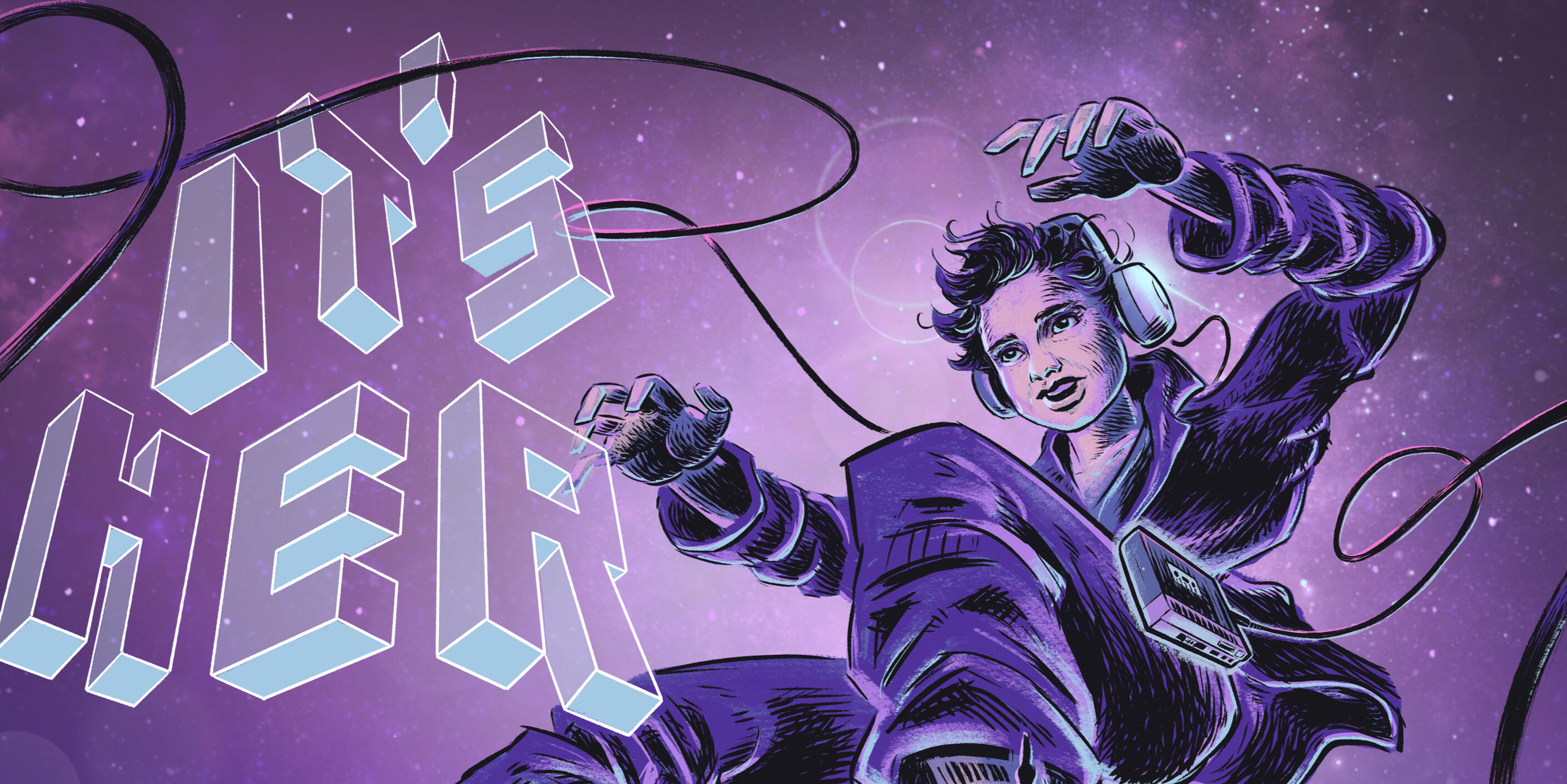
"It's Her" album
Album illustration and design for musician Alexia Chellun

Logo for fashion company rooted in West Africa

Logo created for Tucson-based youth hockey team
southern trust mortgage
Logo design for mortgage company brand refresh


PROJECT
The client from wanted an eye-catching custom vehicle wrap for a van that would be seen widely around the ODU college campus in Norfolk, VA. Their request was to highlight their "One Love" brand.
solution
Inspired by timeless henna art, I wanted create a bold, illustrated design that reflected the hand-crafted care of Cane's quality. Elements of the henna design could be used to brand a campaign for many assets.


meaning behind it
Henna
For many cultures, henna art represents prosperity, good fortune, and love—created for special occasions and milestones. I felt these attributes encompassed the "One Love" theme in a festive motif.
The Heart
To reinforce the concept, I hand-drew the elements within a heart shape that has curves that lend itself to the ornate flourishes of traditional henna linework.
Flowers
The botanical elements of flowers, stems, and vines commonly signify beauty, growth, and love.
Color
The golden yellow and bold red directly echo the Raising Cane's brand colors. The sunny hue is meant to evoke the warmth of a friendly and approachable nature.


PROJECT
Founder Hermann Shasha of Cameroon requested a logo for his independent fashion company of modern African wear, inspired by textiles and patterns of different regions. I was given liberty for the creative direction.
solution
Using photo references from their clothing line, I studied patterns, shapes, and colors that were uniquely used to create a wordmark that could serve as the icon for their brand. I wanted it to be recognizable whether used on a tag or projected for the runway.


meaning behind it
Wordmark
Using the last name of the founder Hermann Shasha, I divided his surname to arrange letters in a perfect square.
Letterforms
Inspired directly from patterns found in Shasha’s clothing line, geometric shapes likes circles and rectangles were used to form the letters for a clean, modern aesthetic.
Weight
Representing the boldness of trendsetting in the fashion world, I created a heavy weighted type that could also stand alone without an addition icon element.
Negative Space
Identical circles were used to create the negative counter spaces for the letters to reinforce the theme of patterns and geometry.

takeaways
I initially drafted a logo that would incorporate several colors (red, yellow, black) that I noticed were used in many of their clothing designs.We came to the conclusion that it'd be best to predominantly use a neutral color (white/black) for the logo. This would avoid color clashing and also allow the the vibrancy of the clothes themselves to stand out.We were both very happy with the final result and their company has seen growth over the years since.

PROJECT
Public media station WHRO in Norfolk, VA created an environment educational series originally called "Earth Matters". With the name changing to "Spotlight Earth", they were needing a fresh, new logo.
solution
Since the logo would be used predominantly used for broadcasting and film, I needed to make its legibility at small scales a priority. The final design uses a bold, sans serif type with an embedded icon to represent the "A".


meaning behind it
Name
The series new name reflected the focus of putting a "spotlight" on the the topic of the environment and climate.
Type
A bold sans serif was used for legibility ease at small scales if used for a screen "bug" or watermark. Condensed characters were used for "Earth", allowing for the word to be larger in proportion, emphasizing it's importance.
Icon
Instead of an icon appear next to the wordmark, I designed it to be embedded as the "A". in the shape of a spotlight. The "O" in "Spotlight" would act as the light source. A sprouting plant leaf serves as the negative space of the "A".


PROJECT
Client requested a logo for a new youth hockey organization with the name "Spartans". The design will be used for several age divisions with the potential for expansion to other cities and possibly multiple states.
solution
I created a professional logo and brand that is recognizable for many applications. Using the Spartan theme, the custom design can be reproduced in 1-3 colors to keep production costs practical.


meaning behind it
Lettering
Bold varsity letters meet the sharp, triangular serifs found in Greek writing chiseled onto stone
Spartan Warrior
Upright posture, looking ahead, symbolizing strength, courage, and readiness for any challenge
Hockey Stick
Instead of a sword, the hockey stick becomes a weapon for defeating opponents on the ice
Shield
Though not the classic disc shape, it combines round edges and sharp corners to be consistent with the design


takeaways
I needed to be mindful that the final logo needed to meet the criteria of a standard logo. The challenge for was initially creating an fun illustration, but with too much detail. The end result is a balance of a dynamic graphic that can still be reproduced well for a variety of needs.

PROJECT
Musician Alexia Chellun requested a digital graphic for her EP. It would later be one of the album’s she wanted to sell on tour, so would be needing additional artwork for the printed CD packaging.
solution
One of the songs on her EP called “Eternal” was the inspiration for the cover art and then eventually for the back and CD art. I suggested the idea of a comic book style illustration, given the sci-fi direction.


meaning behind it
The Title
‘It’s Her” is the one of the singles featured on the EP and was chosen by Alexia to be the name of the album. I drew this custom typography as 3-dimensional blocks, turned in different directions as if they were suspended in space without gravity.
Space
One of the songs included on the EP called “Eternal” was the main inspiration for the celestial theme and imagery of the album art—in particular lyrics such as: “So I choose to jump parallel realities“, ‘I believe in time travel’, and “I believе we're not here alone in this universe”.I also liked the idea that music has a way of transporting the listener. An old school Walkman cassette player needed corded headphones that could emulate an astronaut being tethered to a spaceship. The CD shape lent itself to a full moon to continue the narrative.
Astronaut
Alexia had done a promotional photoshoot with a blazer and sneakers and suggested that outfit could be used for the illustration. In homage to the steps on the moon, I depicted the footprint of a vintage sneaker for the back cover.


Nick is a designer and illustrator currently living in Virginia. He received his BFA from the School of Visual Arts in NYC. At graduation, he was honored with the Rhodes Family Award, given to select graduates for outstanding achievement.
Nick is a designer and illustrator currently living in Virginia. He received his BFA from the School of Visual Arts in NYC. At graduation, he was honored with the Rhodes Family Award, given to select graduates for outstanding achievement.
about
Nick is a designer and illustrator living in Colorado. He received his BFA from the School of Visual Arts in NYC. At graduation, he was honored with the Rhodes Family Award, given to select graduates for outstanding achievement.He's been featured by Xerox, Mad Magazine, Washington Monthly, and Netflix. He was the lead conceptual artist for James Carman’s award winning ET documentary, The Hidden Hand. Recently, he was the Art Director for "Intergalactic Godspeed", an educational animated series addressing environmental issues (in development).
ShaSha African Wear
( case study )
problem
ShaSha is a small, independent fashion clothing line with only a few employees. They want to give the impression of being a much larger, professional company.
solution
Create a custom logo and brand that reflects the identify of Shasha's African roots, while keeping a modern aesthetic. The logo should be unique and scalable—from a garment tag to a runway show backdrop.
"Rising Son"
Kubo and the Two Strings
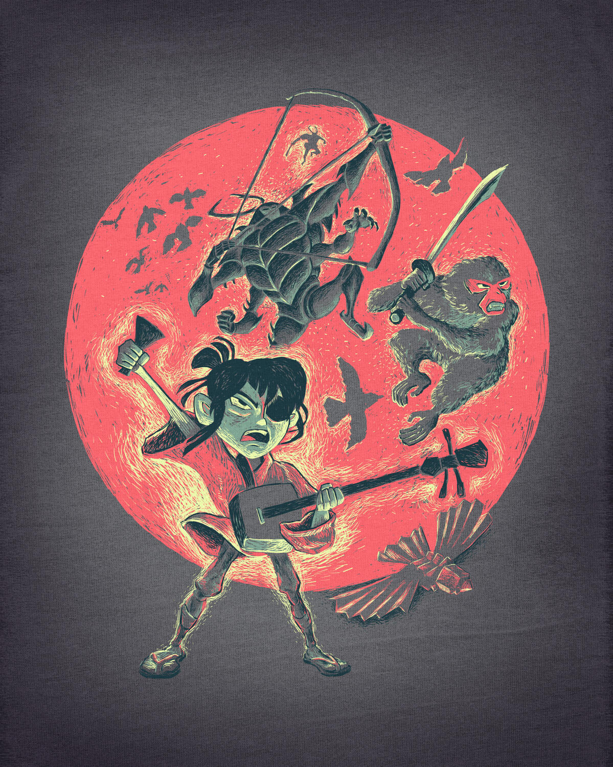
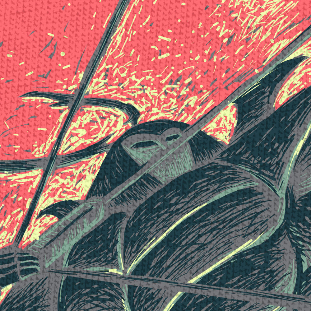
Officially licensed apparel via Threadless.com (Out of Print) | “Kubo and the Two Strings” is a fantastic tale inspired by Japanese lore. I wanted to capture a dynamic spirit of camaraderie with bold colors and an iconic rising sun, as depicted in Japan’s national flag.
"Wondrous Nightmare"
The Nightmare Before Christmas
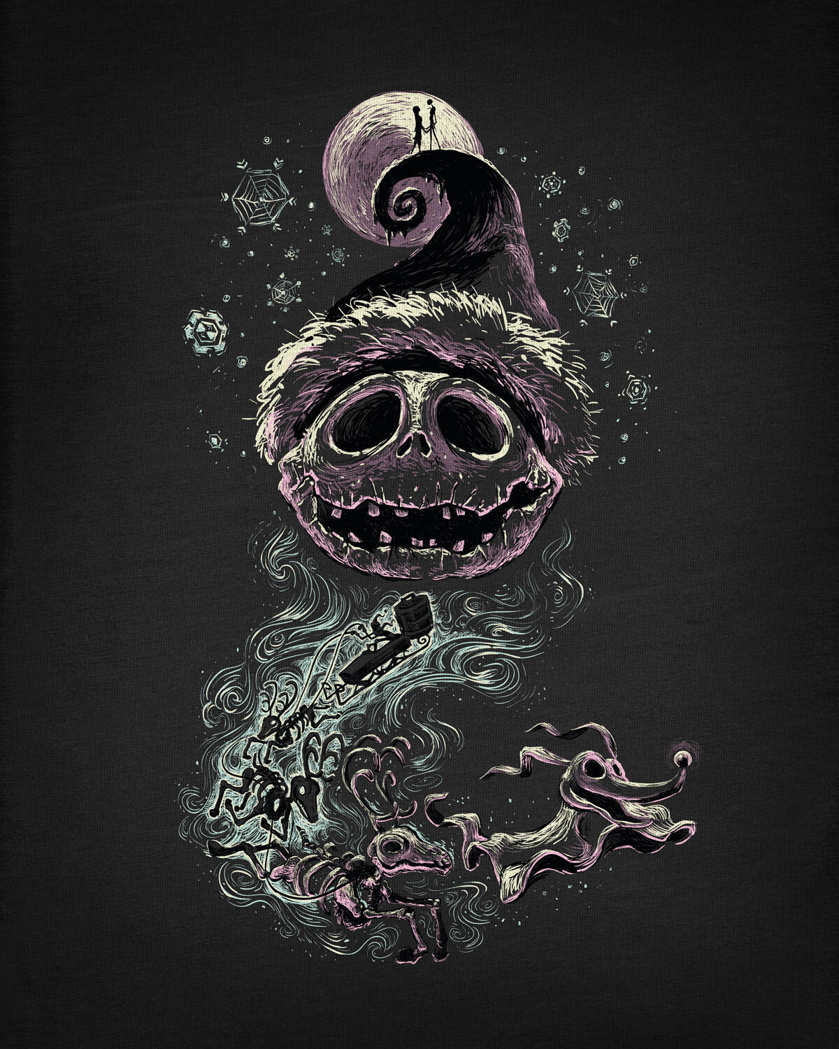
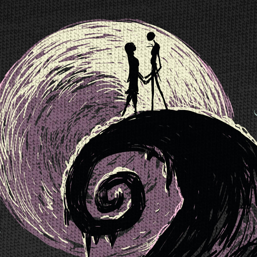
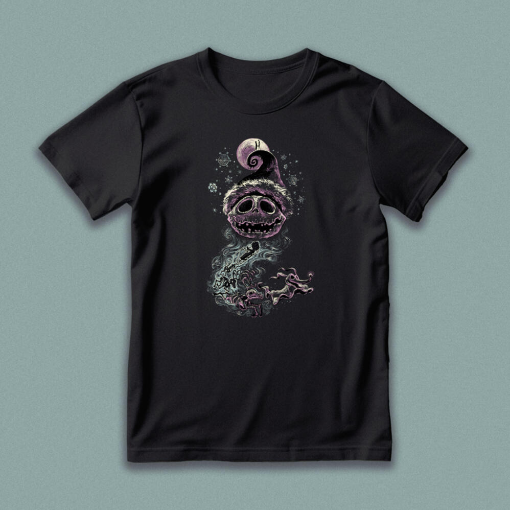
From the classic “The Nightmare Before Christmas”, my design celebrates the whimsy and wonder of Jack Skellington’s unexpected adventure. The fern-like mountain evokes Santa’s cap, reincarnated reindeer become a flowing beard, while snowflakes and spider-webs blend holiday themes.
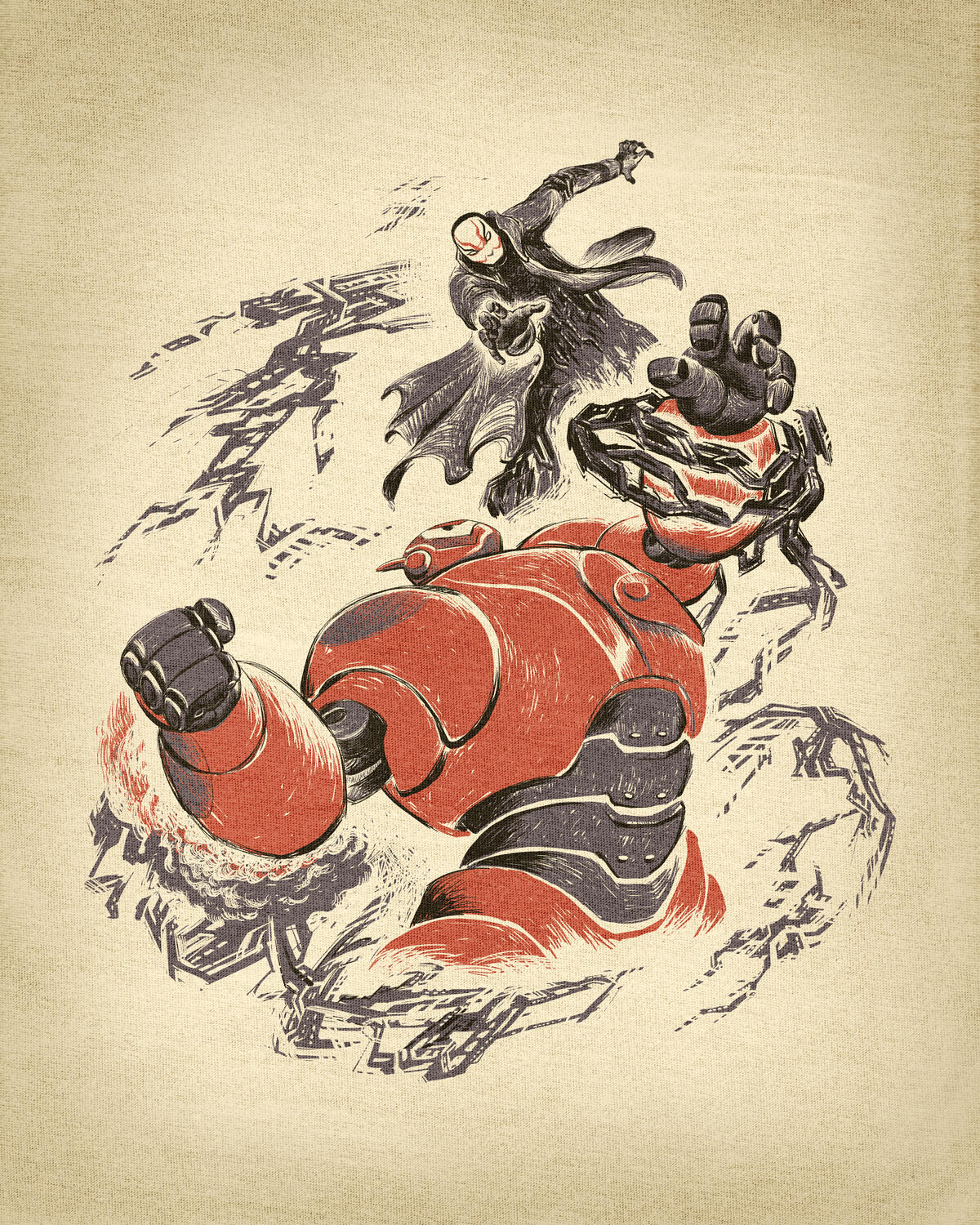
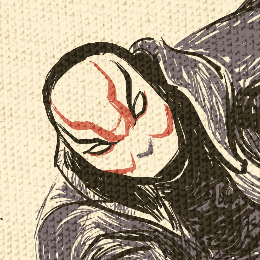
"Fearless"
Underdog
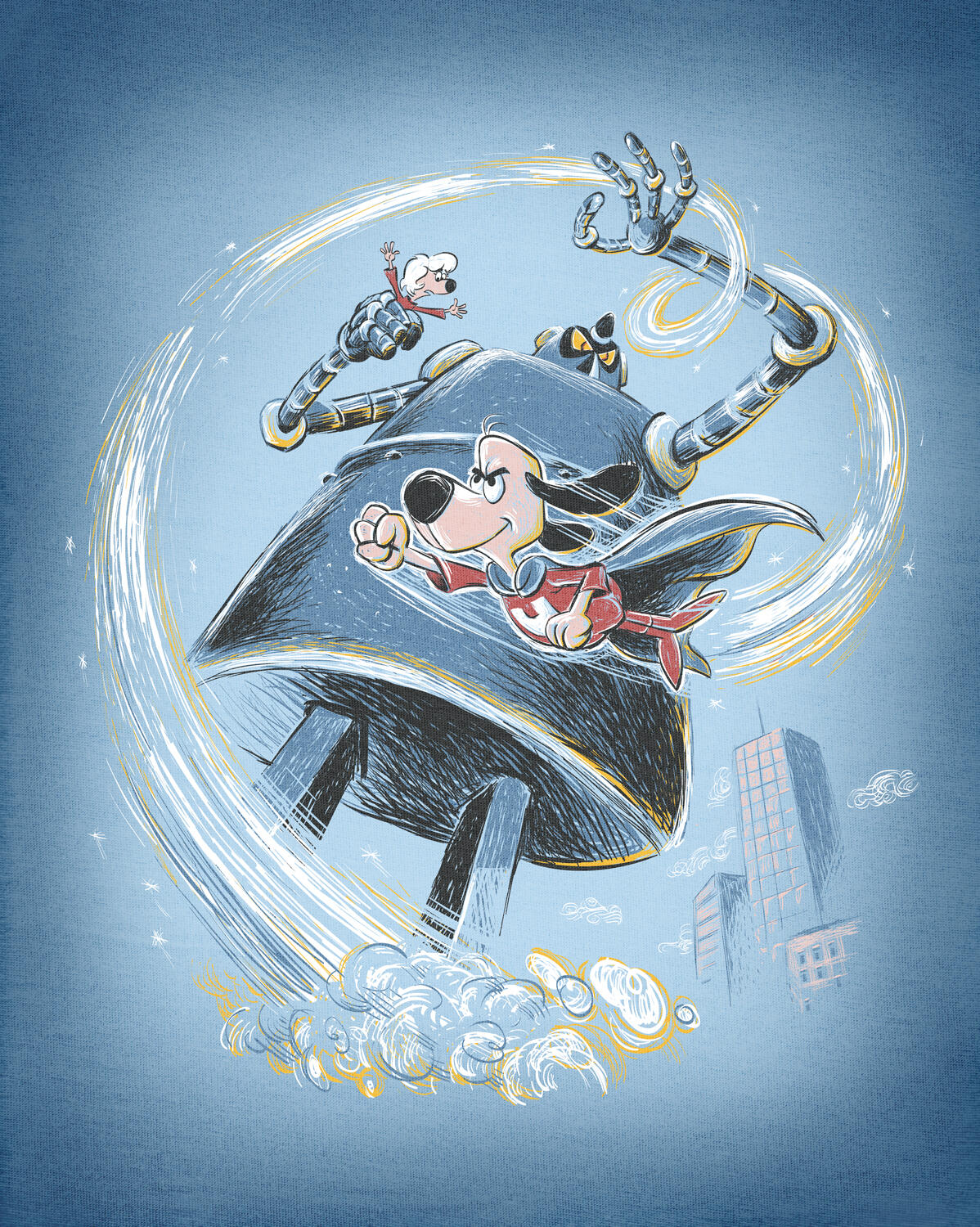
Officially licensed apparel via Threadless.com | In my design "Fearless", I wanted to champion all underdogs like our undersized caped crusader. Sometimes our courage cannot be overshadowed—even by 50ft robots.
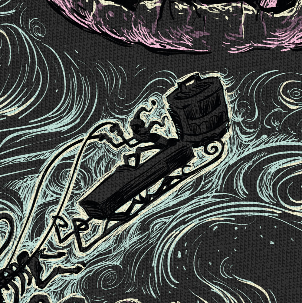
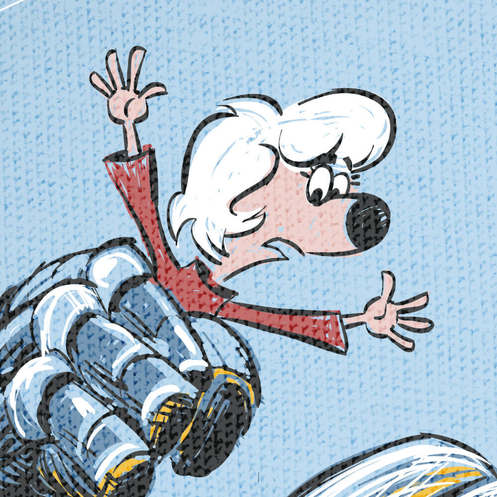
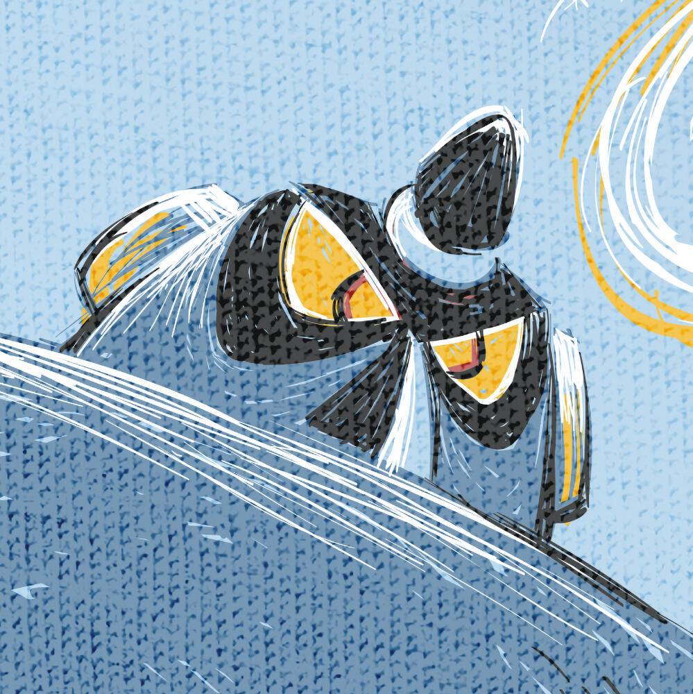
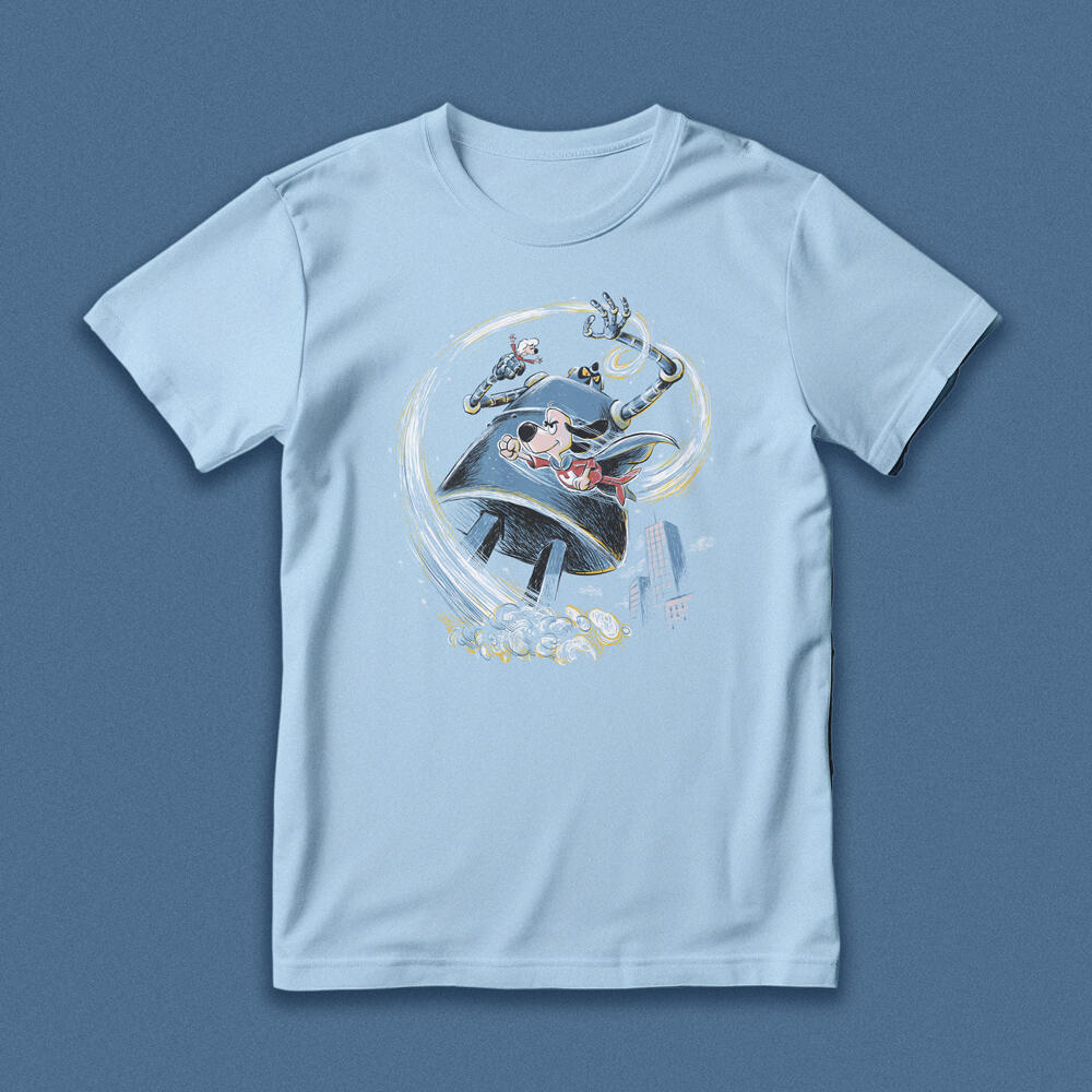
"Bot Fight"
Big Hero 6
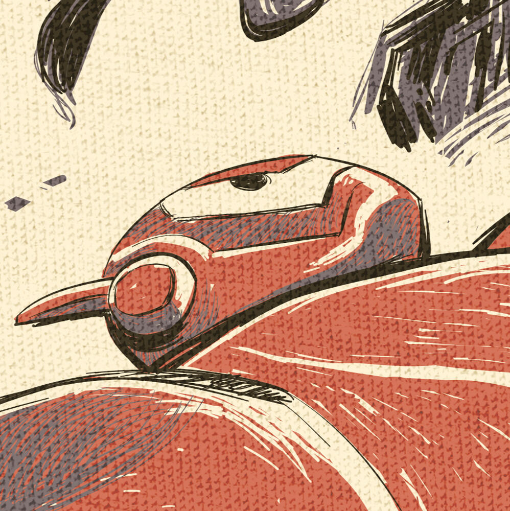
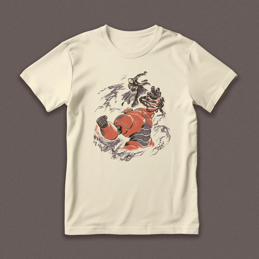
Officially licensed apparel via Threadless.com | For Disney's "Big Hero 6", I was inspired by Japanese woodblock prints to depict this battle between bots. Though the setting is futuristic, these opposing forces are as ancient as printmaking itself.
"Sub Mariner"
Zero's Subs
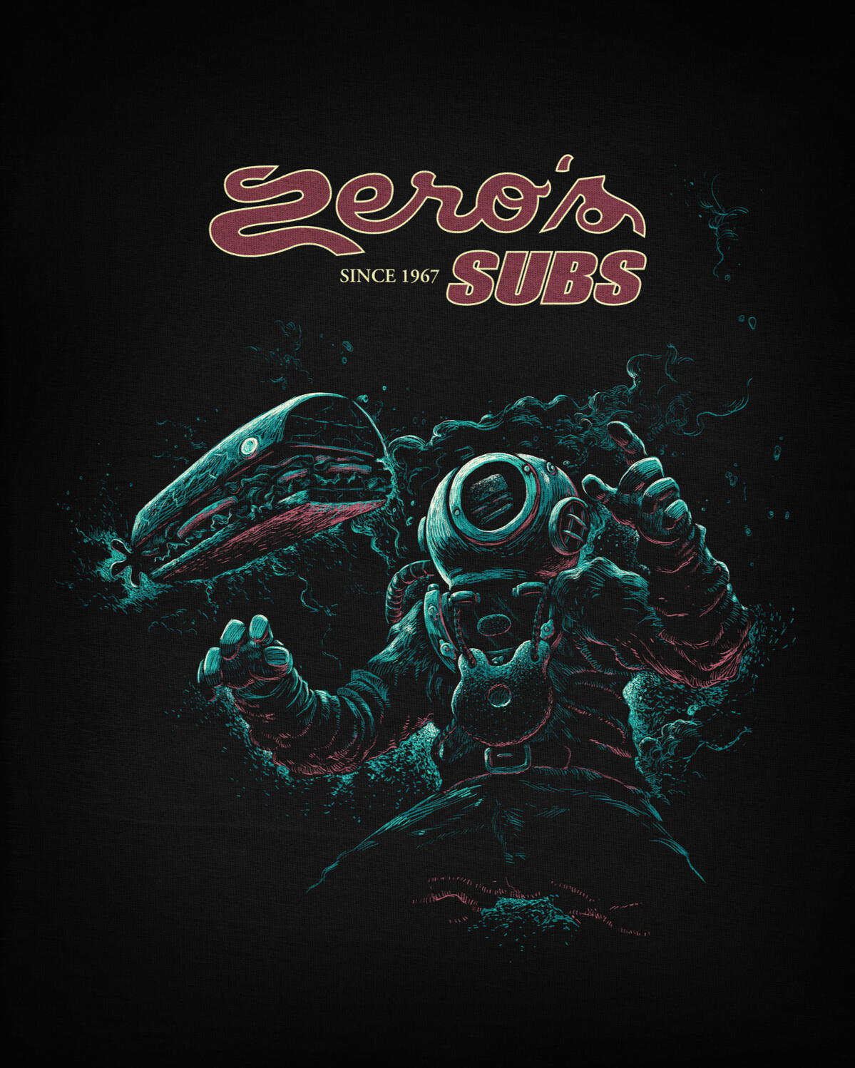
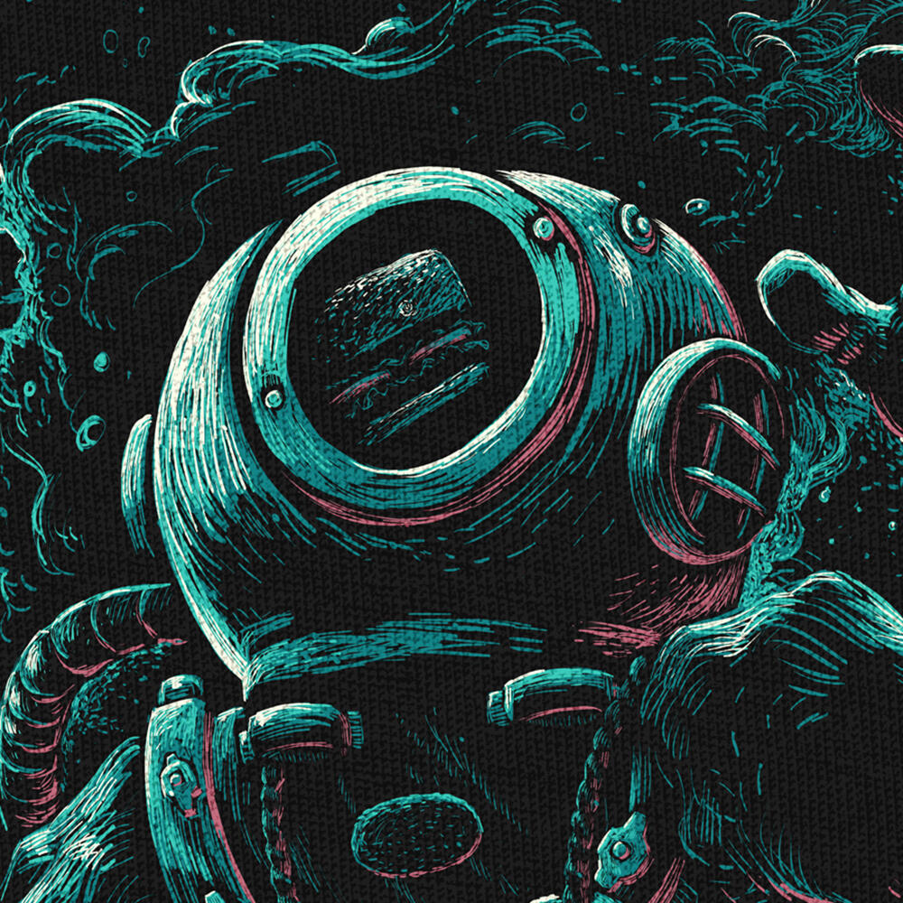
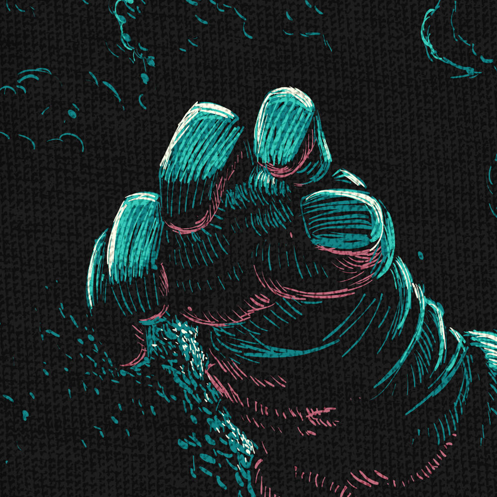
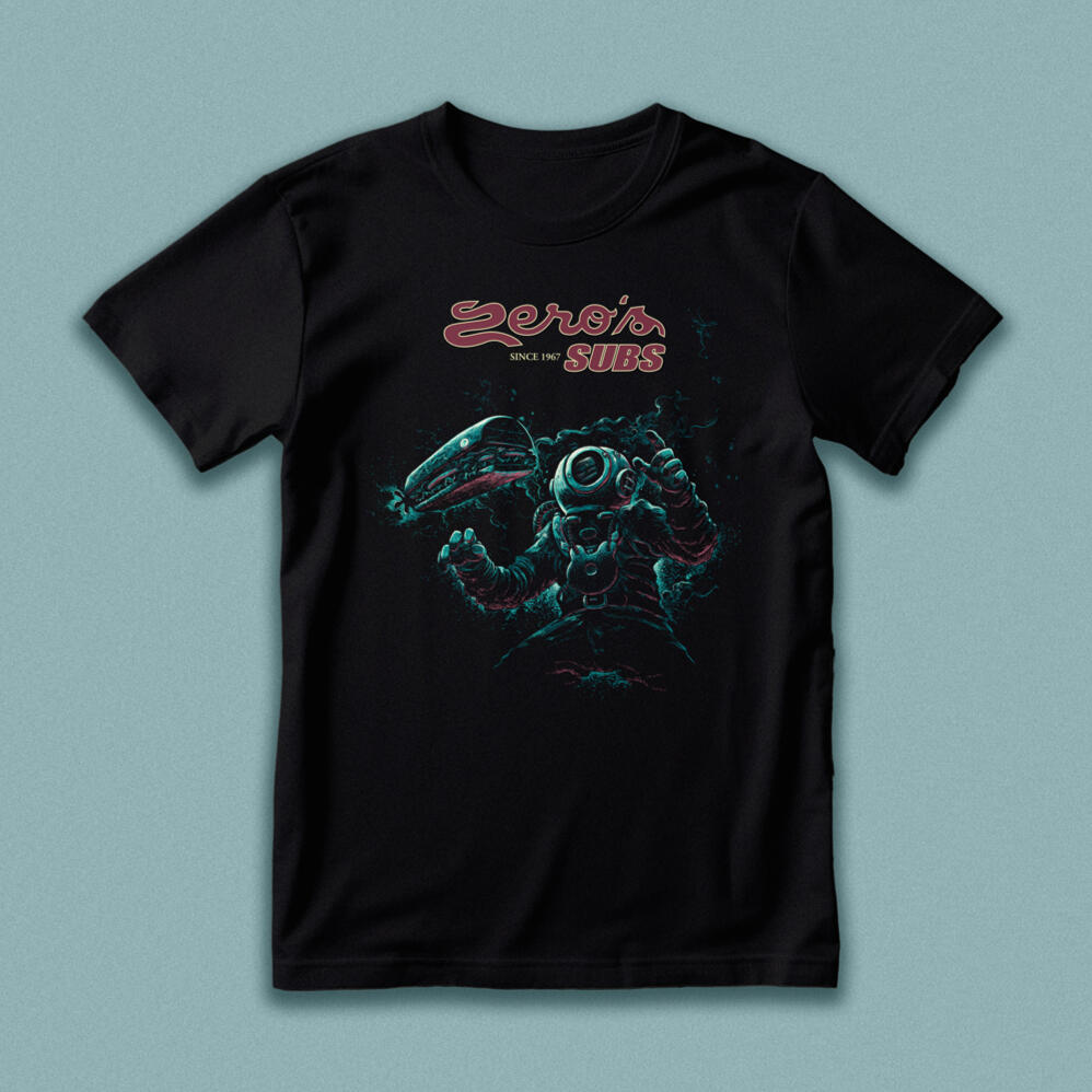
Concept for Zero's Subs t-shirt | Sink your teeth into this delicious design for this Oceanfront originating sandwich chain. Classic engravings inspired this appetite for adventure. Thankfully you don't have to travel 20,000 leagues to catch a sub worth diving for.
"Love Mob"
Broadcast Church
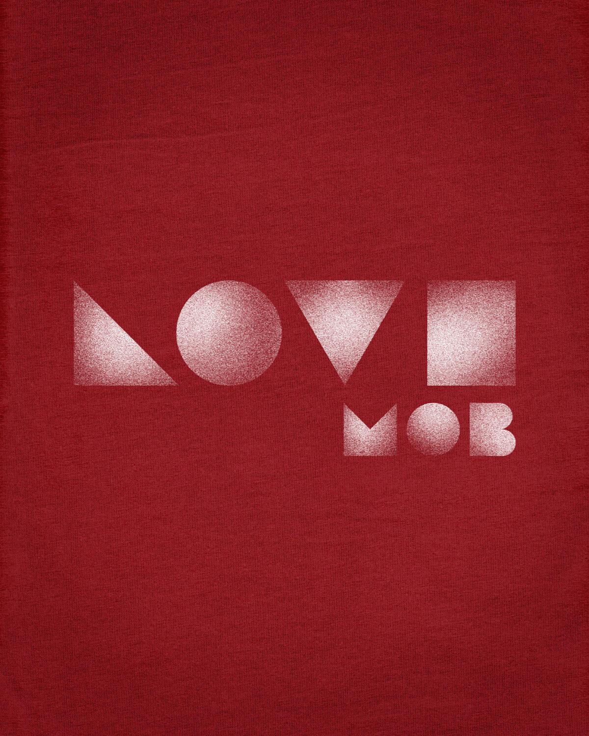

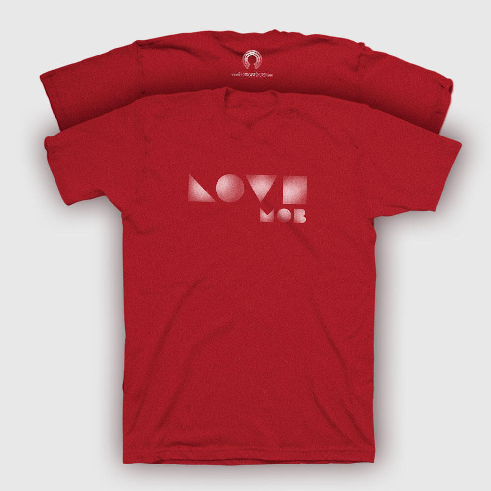
Four simple shapes to represent four simple letters, designed for Broadcast Church's volunteer ministry. Helping those in need can seem challenging, but sometimes the best outreach is within arm's reach. I wanted to create a graphic that speaks that idea—loving our communities can simply mean being there for someone.
Cliatt Reunion Shirt
***
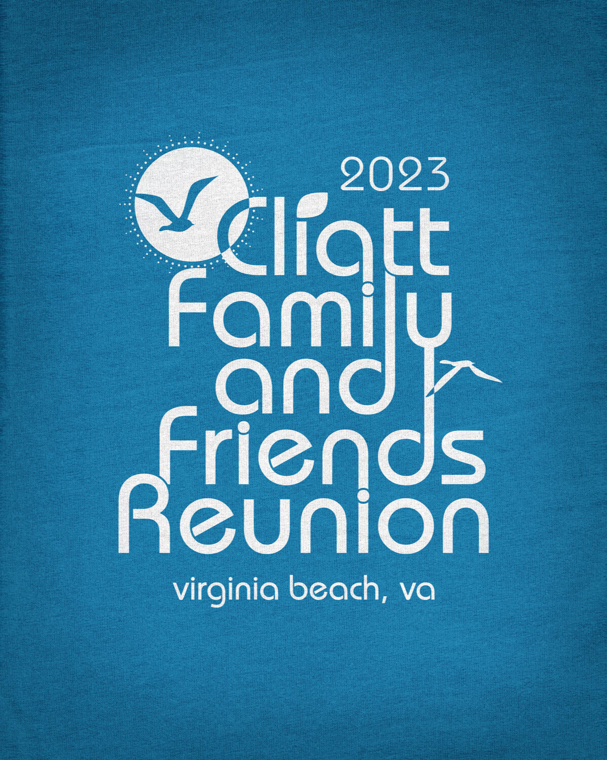
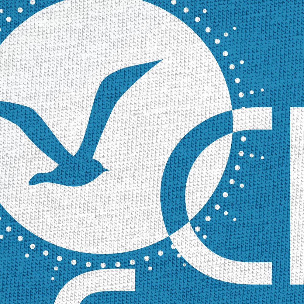
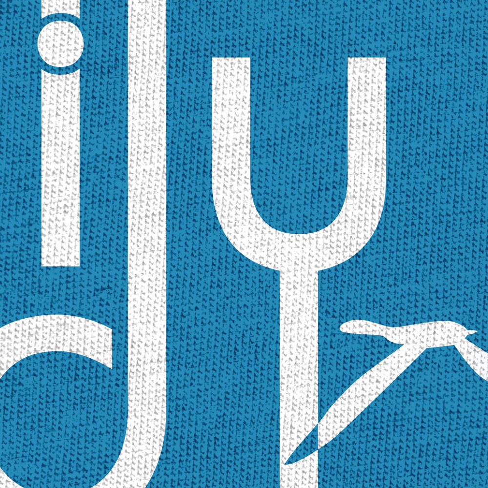
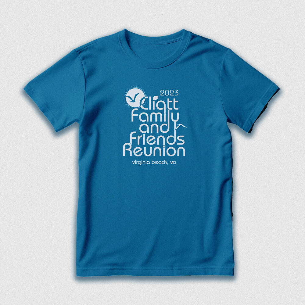
Client was seeking a reunion shirt for a large gathering. To work within their budget, a one color design was suggested. I chose the Bauhaus typeface because of its inviting sans serif appearance. Its lowercase glyphs also lend itself to be linked to other letters—emphasizing connection.I picked a vibrant Emerald Blue shirt that evokes the ocean. The seagull in the sun uses negative space to incorporate the shirt’s fabric, acting as second color for the cost of one. Both the client and I were very happy with the final product.
Mind of Michael
Michael Jackson Tribute shirt
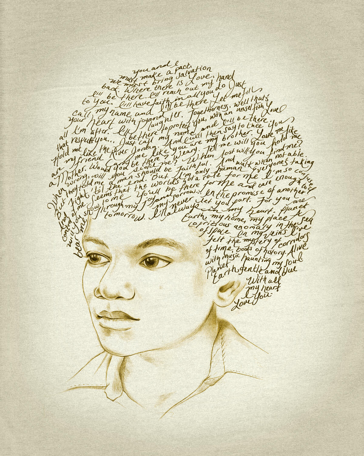
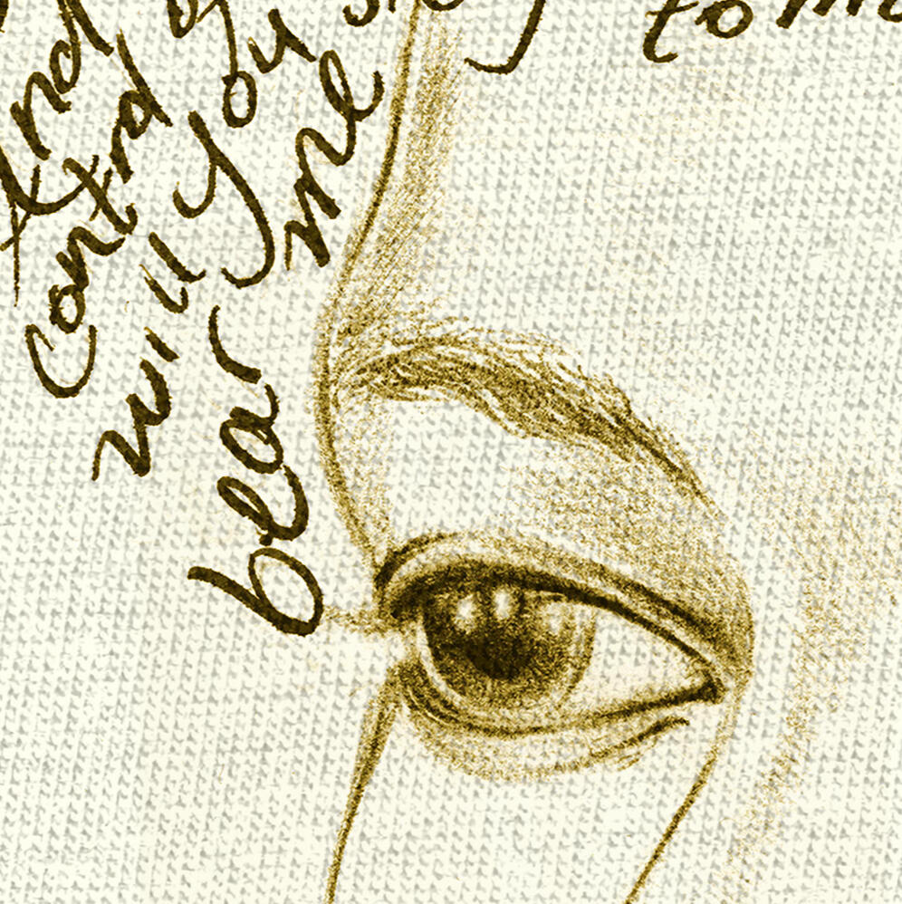
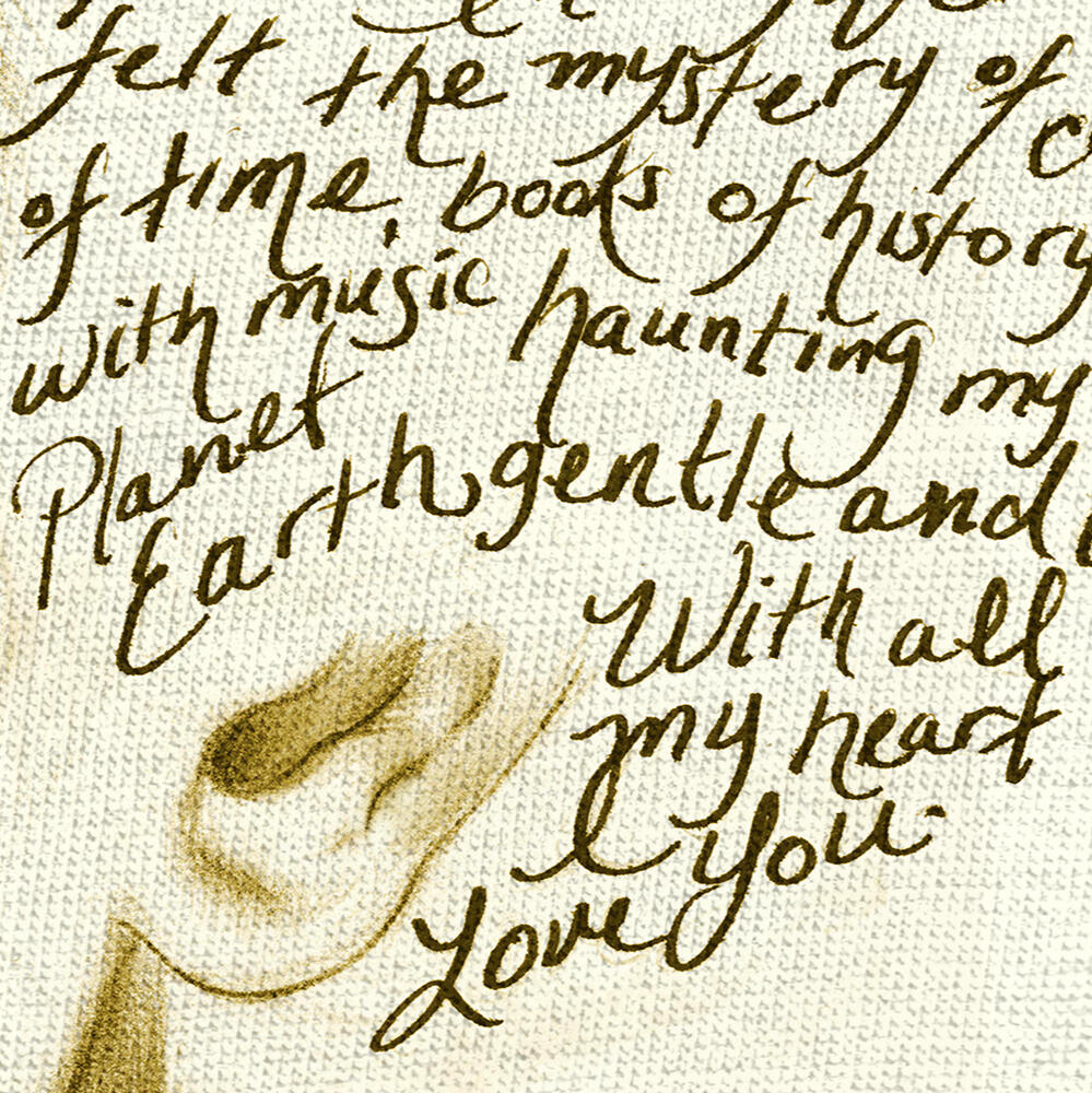
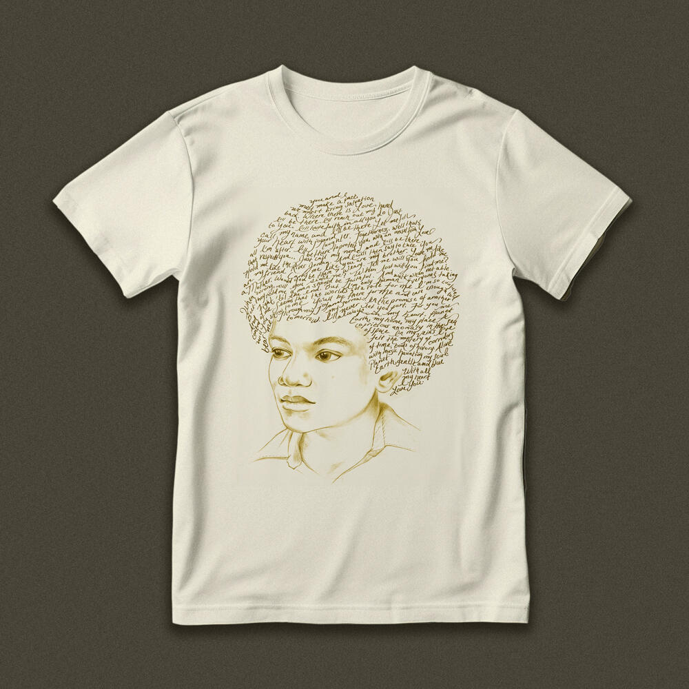
I chose to handwrite lyrics from various songs in Michael’s career as if it were a diary entry—a more personal reflection of his heart and mind. He sang about healing our world, so I chose a sepia looking ink for a natural tone and a tan, recycled cotton material for the shirt (also adding to the effect of aged paper).
Popeye
***
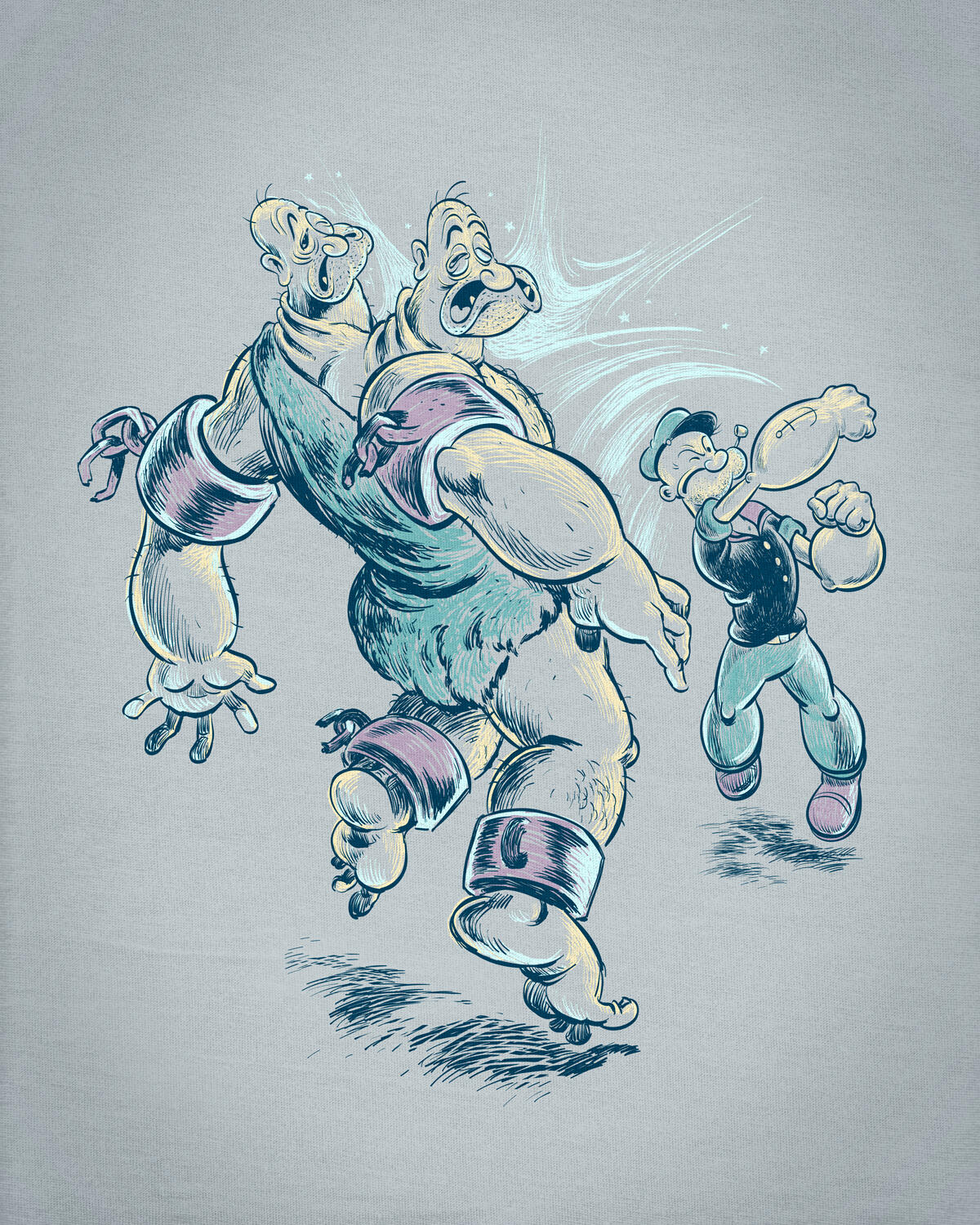
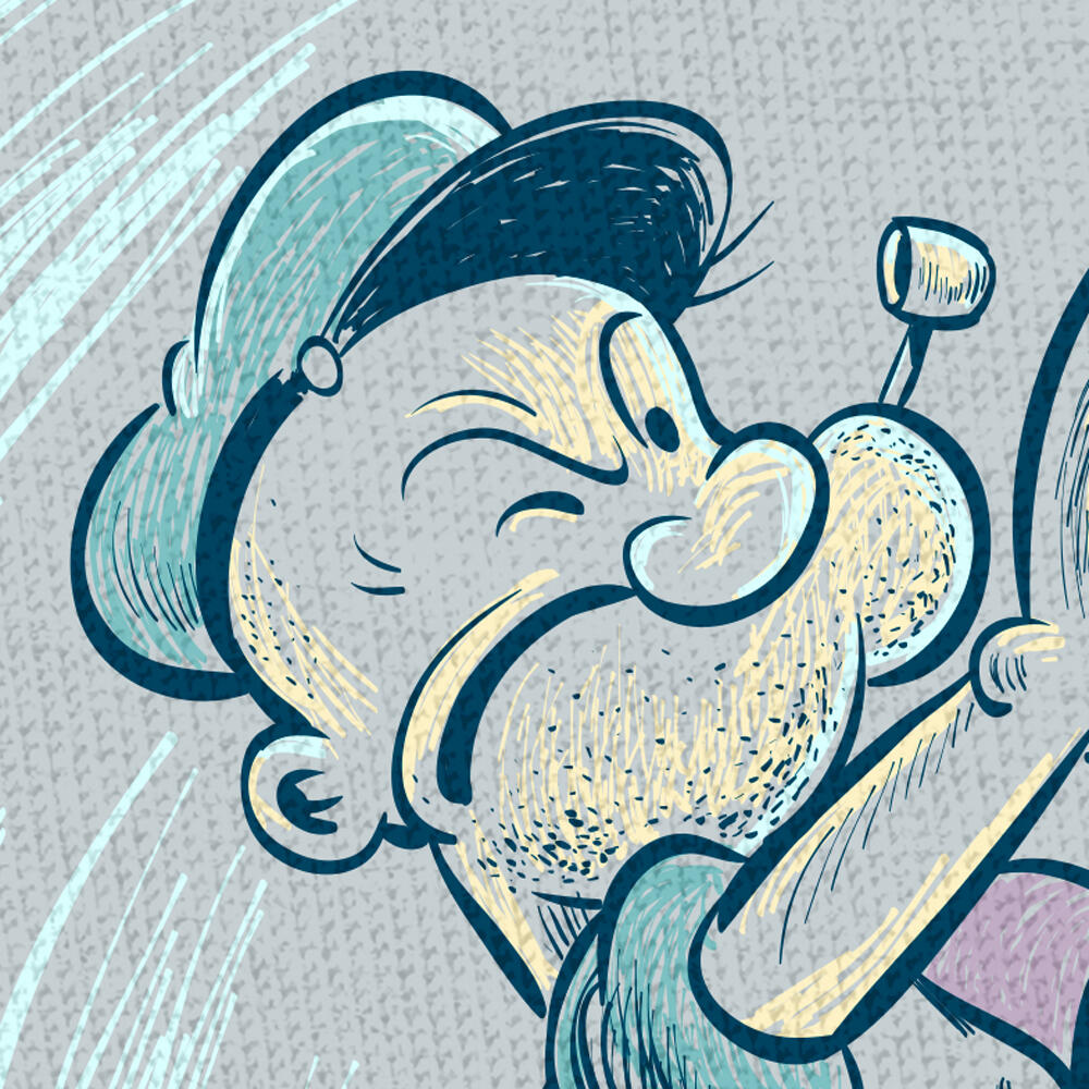
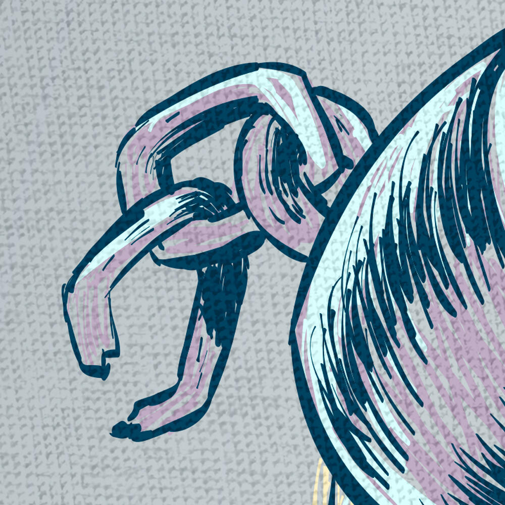
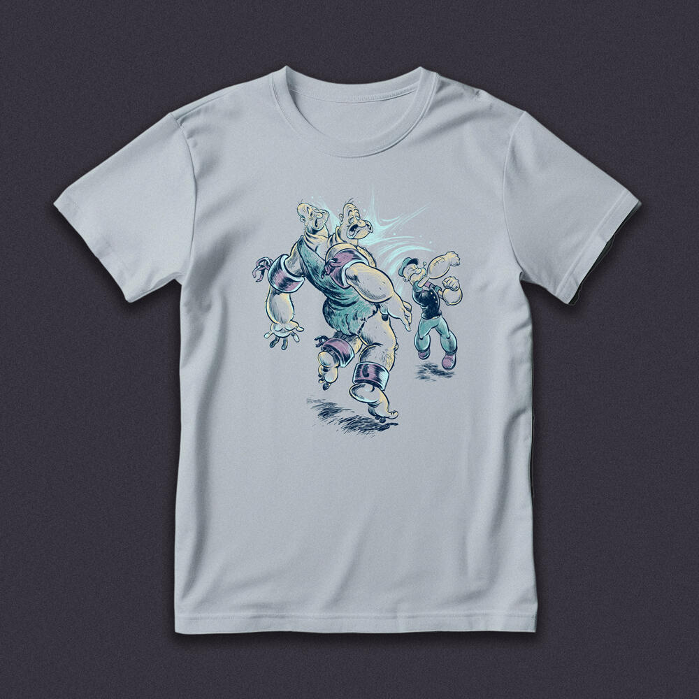
Two heads are usually better than one—unless that one has a familiar sailor's hat and a physics-defying pipe. Nearing 100 years old, Popeye can still land a timeless punch and several punchlines under his breath.
"Memories of Vulcan"
Leonard Nimoy Tribute Shirt
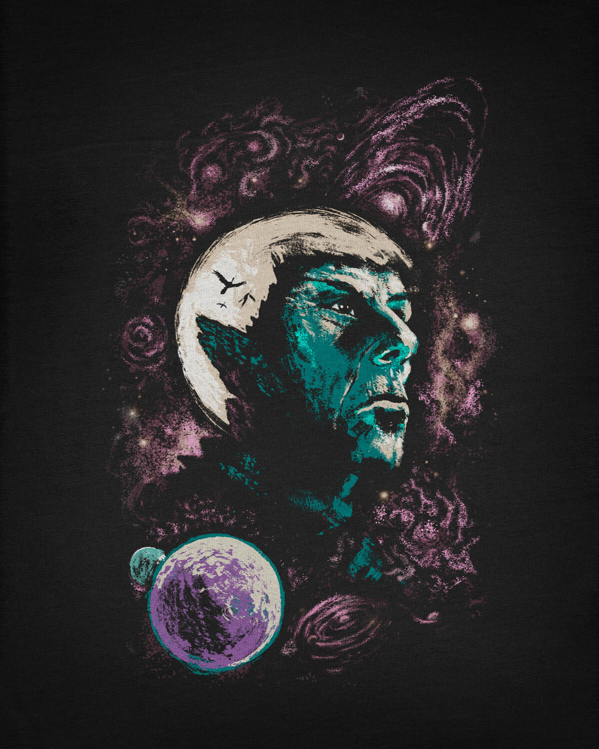
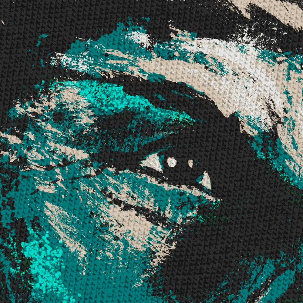
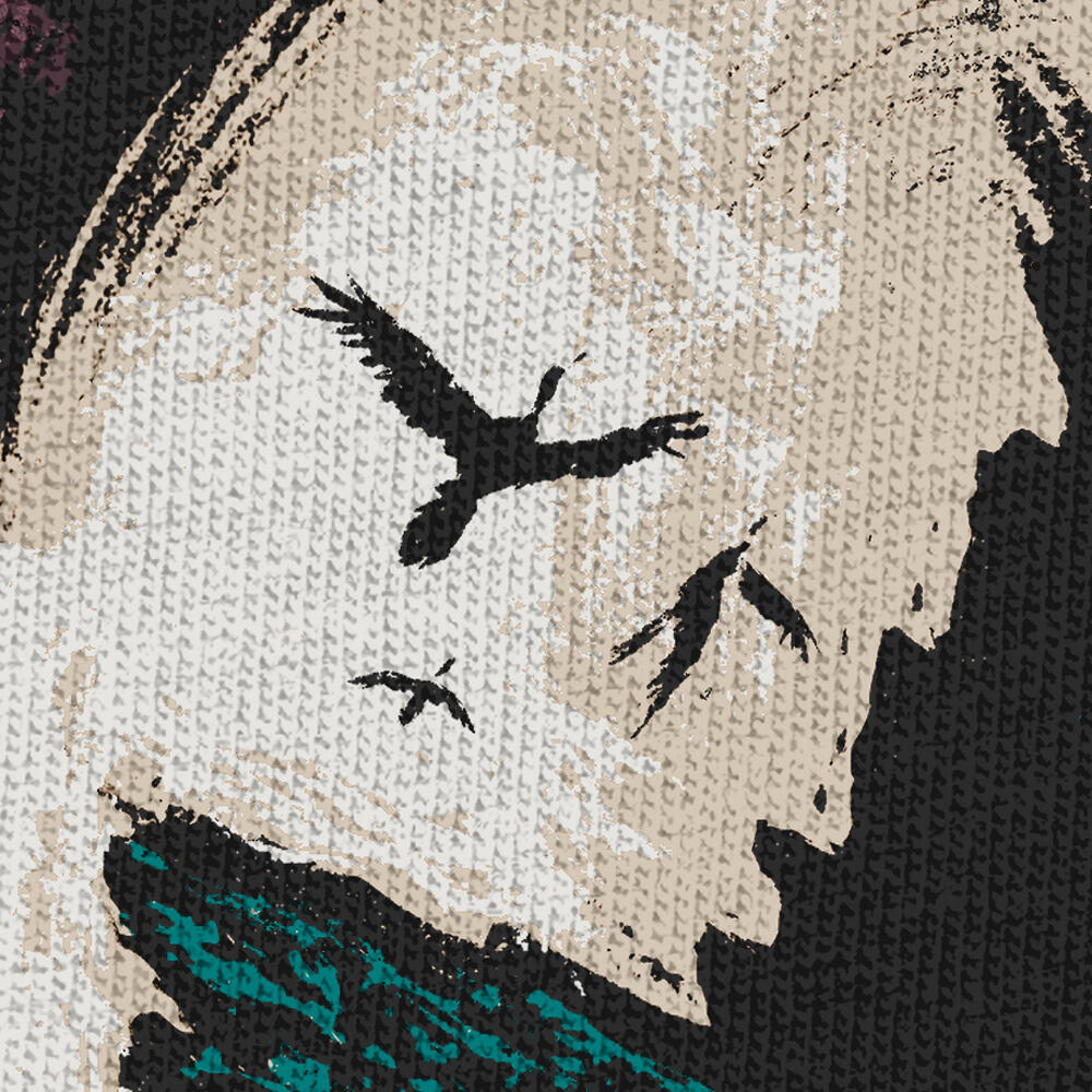
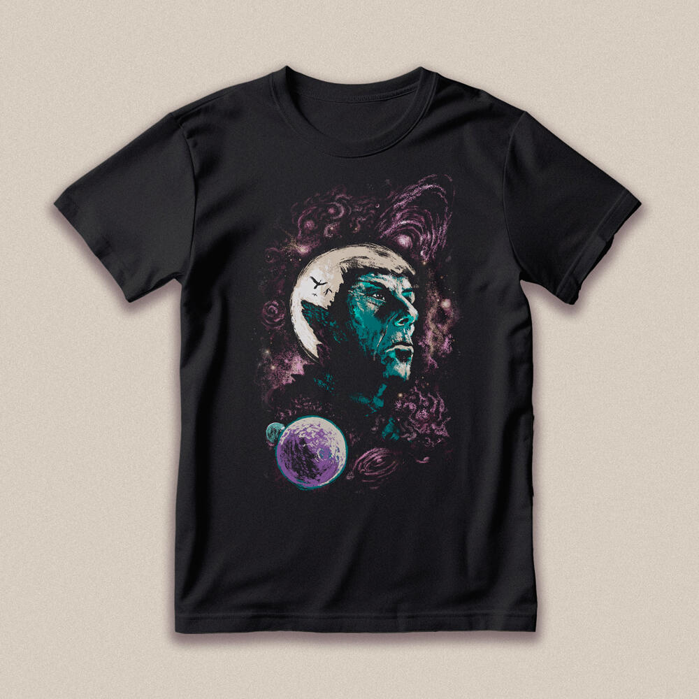
In this tribute shirt, I wanted to pay homage to Leaonard Nimoy's most iconic role as Spock. The rugged cliffs from his home planet are an illusion of the iconic Vulcan ears. His legacy will surely continue to live on and prosper.
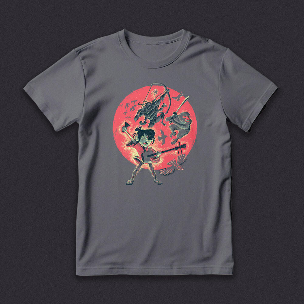
"The Guardian"
Kung Fu Panda
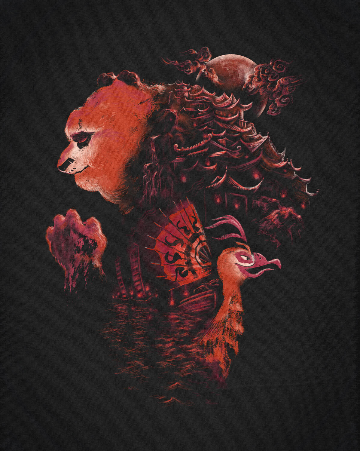
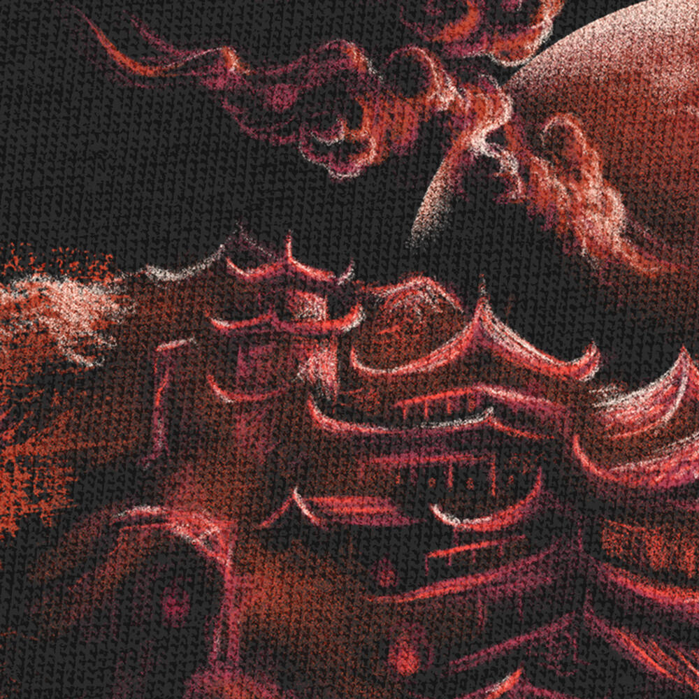
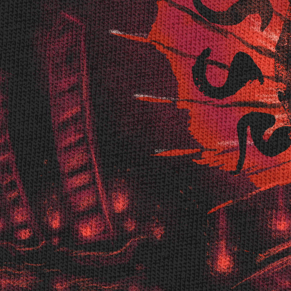
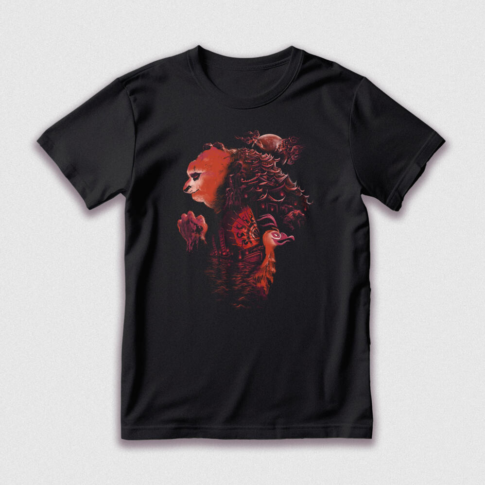
With a heart as big as his appetite, Po has put his village on his back in this Kung Fu Panda design. A ship's sail becomes the feathers of the film's most fowl protagonist, Lord Shen. Outsmarted but not outmatched, our hero always finds a way.
"Beast and Fowl"
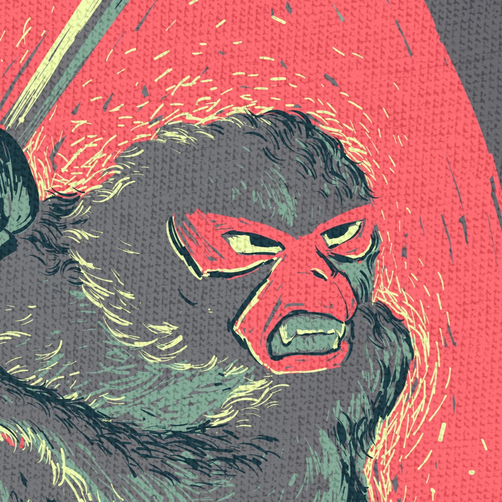
***
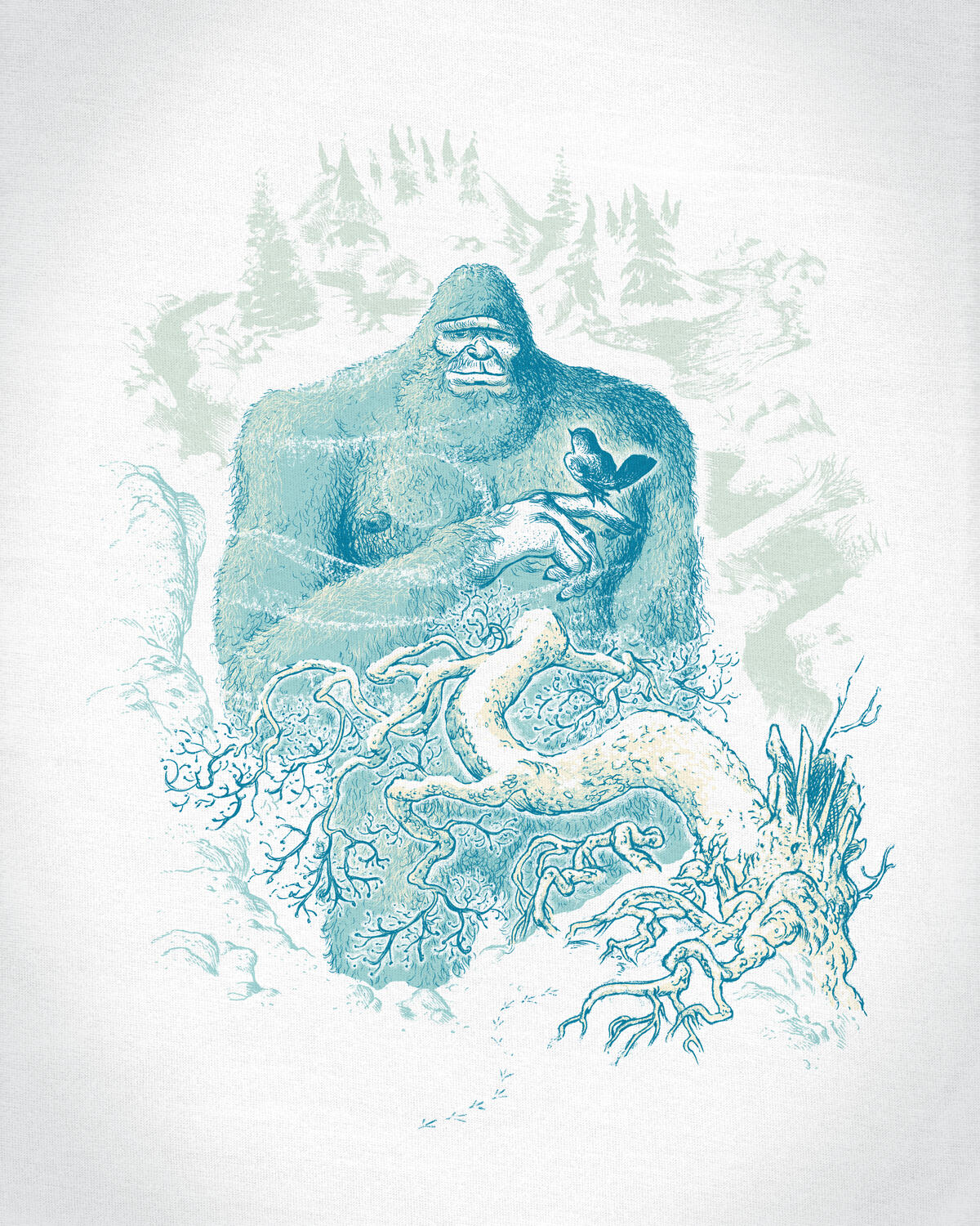
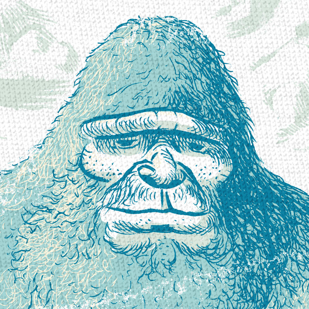
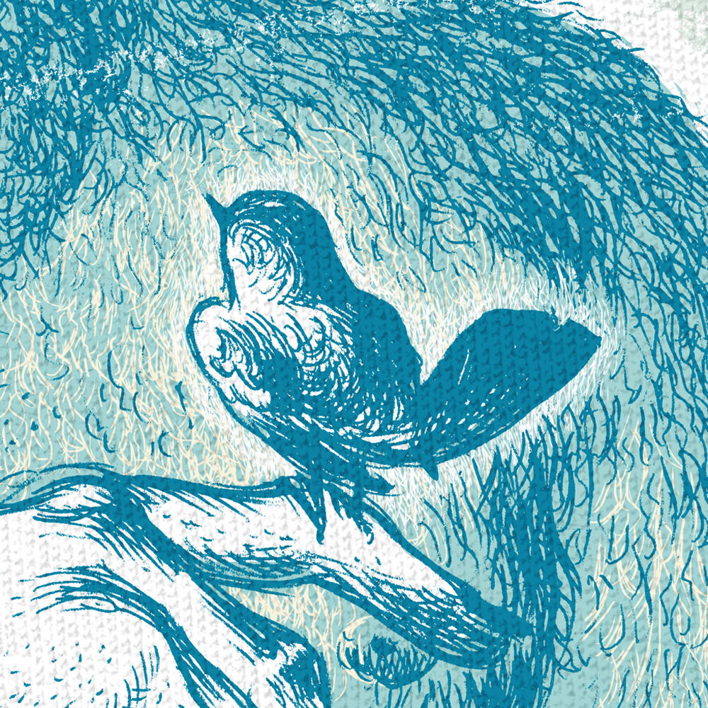
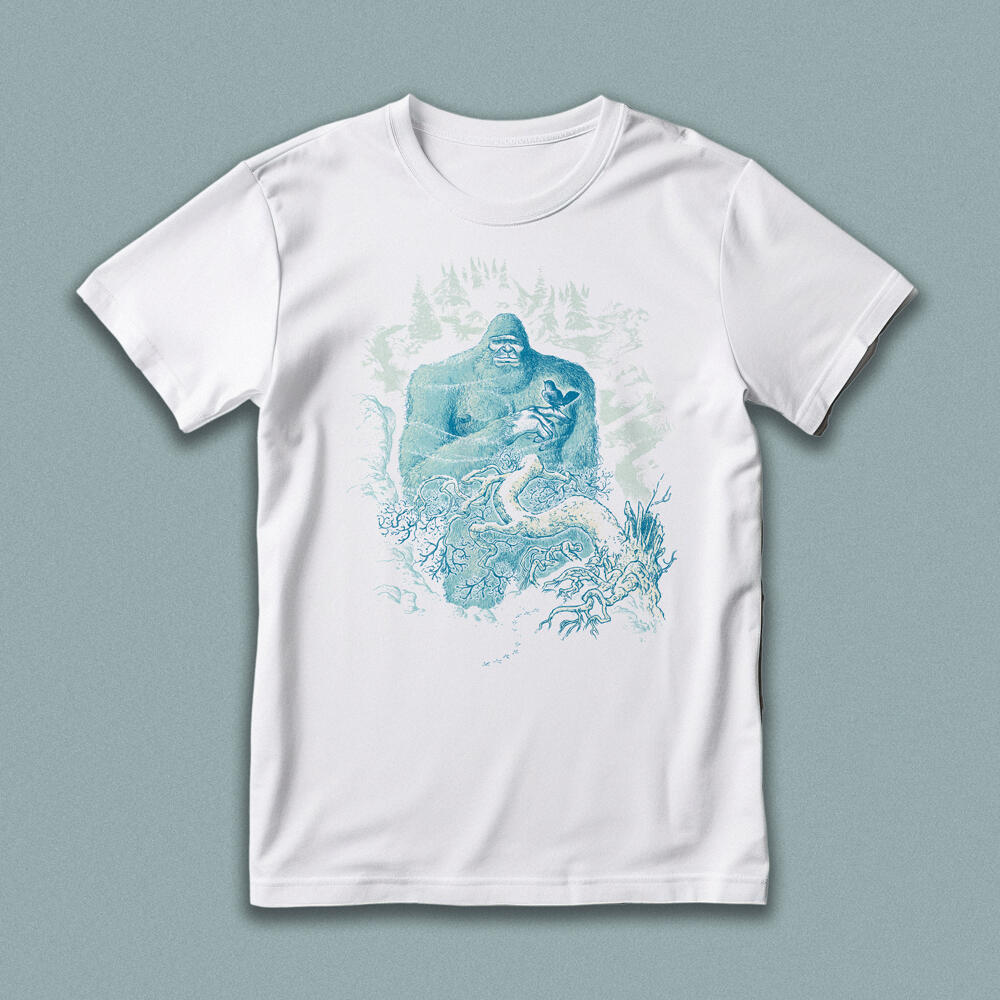
Yowie. Yeti. Orang Pendek. Bigfoot. Sasqautch. Skunk Ape. The elusive wild one of the woods is often feared and revered. Nonetheless, this great beast is not too big to overlook the least among us. However the size our footprint is, all creatures leave an imprint on this earth.
apparel


video